After watching Stanley Kubrick's "A clockwork orange", it always led me down a path of wonder when it came down to the various movie and novel art work for this tale.

I was always mythed by the use of the triangle which Alex was appearing through and the use of the eye ball. Bill Gold's choice of typography is to be questioned in this instance, in my opinion.
 I feel Bill gold's choice of typeface for this specific poster, based on a film of Ultra violence, rape and harrowing scenes, is a choice which is an arbitrary decision. I'm sure Bill Gold can justify his use of font in this instance, but personally it has connotations as a juvenile typeface not to be taken seriously, such as the modern Habbo hotel logo.
Lots of things about Bill Gold's cover of ACO generally make me question things, along with the imagery attached to this novel in general.

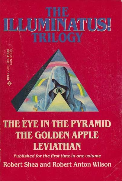
The use of the triangle on the cover of the film suggests illuminati to me which is often depicted by a triangle, the eye is something which is questioned by me. I see how the film is based on a alternative England, which abides by similar rules, but is evident how it's not our ordinary England.
 Having wanted to research what I was questioning about this film poster, I began enquiring:
http://www.collativelearning.com/ACO%20chapter%2014%20.html
Here is a site which analyses the movie poster, each aspect of it and particularly the parts which require an explanation.
This analysis goes into great detail to compare Bill Gold's film poster, and any Clockwork orange art work, in which Alex is depicted atop of the triangle, as a comparison to the The Eye of Providence, a figure which now is represented as part of the Illuminati conspiracy.