Friday, 28 February 2014

Research into Colour for 'The Sauce'

In our heads, as a group we chose to go down a route of Mint green and the connotations attached to it, which firstly what came to mind was Fresh. Also, how our concept is based on sauce, I thought of ketchup and how ketchup starts as a green tomato then becomes red, it felt fitting.
We felt that green has a more formal feel than other colours available, and I particularly don't see many companies that makes use of a green colour scheme.
Here displays a range of green pantones which could be considered for the designs which I am to create. 
I am going to stray away from the green spring colours, despite them having connotations of spring, growth and fresh, newness, because the colour is too sharp and saturated for what I'm aiming for.
I felt that these selection of green colours that I have chosen have connections to Ice cream, and that the use of colour on screen looks like an ice cream parlour. 
This can be bypassed by careful design decisions, I must ensure that the branding that I create explains what 'The Sauce' company does.

Wednesday, 26 February 2014

'Dyslexia didn't stop them'

"The 9 pieces of celebrity portraits were actually an experimental execution for this campaign I did for the Dyslexia Association of Malaysia. The doodling treatment was not the main idea but I wanted to show that dyslexics can turn a simple doodle into a work of art. After all, dyslexics are known to be people with a good art sense and problem-solving skills. As a dyslexic myself, I am a testament to that fact."


These illustrations make use of celebrities who have achieved success despite having dyslexia.
These posters are an attempt at reducing the stigma attached to dyslexia by showing the celebrities, with proud faces and attaching uplifting quotes of dyslexia to the pieces.
The execution of these posters using a biro pen and linking the typography to the design is very effective, this appeals to me a lot.
This form of illustration is something of which I am very fond of.

Three little pigs:

"The 2012 advert by the Guardian newspaper where the 3 little pigs are arrested for boiling up the big bad wolf and cause controversy and the public to explode via media attention and social sharing

I hope more companies start to get creative with advertising like The Guardian have done with this 3 little pigs masterpiece, It definitely has to be the best advert I've seen this year!"

This advertisement focusses around how the news can be twisted and the audience sometimes may not receive the intended message or story that has been broadcasted. The story focusses around the classic story of the three little pigs and the big bad wolf, a tale that every single person will know, and the advert twists the story to explain how news can easily be manipulated.

The advert is kept surprisingly simple at all corners, despite how complex the message is which The Guardian are intending to convey. The pig characters are people which are treat like every day human beings, yet are dressed like pigs for the purpose of the story, as is the wolf, simple effect of personification to make a character and an animal a real focus of a deep story.


The Guardian created this advert which is a slant on things seen as they themselves are a company who broadcast the 'news' so they could be responsible for portraying twisted stories, where they are subliminally attacking other news companies whom are this company's rivals.

In summary, the advert looks very complex but if the viewer narrows it down to layman's terms, then as i've explained, it is a simple story which has been twisted by quite an interesting and difficult concept to visualise, which has been executed successfully.

Still though, I can see the flaw in this which is that the Guardian are attempting to swing the blame of twisting the news, something which they, a news company are claiming not to do.

Dumb ways to die

Dumb ways to die is a viral video which has earned it's online success as a song to promote rail safety.
This screenshot above shows the style and tone of the video, the popularity (expressed by the amount of views) and the creator/uploader of the video.
The subject of the video focuses around endearing characters which each harm them selves, by acts which would kill a person, and then dance around foolishly. The video is supposed to have a light hearted and sensitive feel as it is aimed around young children, the music playing shows this.
The video concludes by showing four more ways to die which involve rail ways and how they can be perilous in an everyday situation. This is where the informative side strays away from the purely entertainments basis.
As the video runs, it leaps from purely ridiculous ways to die that everyone, even children wouldn't attempt, to rails ways which children could be unsure about, in a shocking conclusion for someone who wasn't aware. 
This video is based around a concept of how obvious something can be and how people are already in the know, to show how something not so obvious can be just as bad.
I have an issue with this video in that if the viewer wasn't to watch the final 15 seconds of the video, they would never know it was focussing around trail and rail safety, which could lose clarity of the message, if the viewer wasn't engaged enough. 

I also feel the entertainment factor and how the soft music and endearing characters draw the audience in slightly takes away from the message, and is the reason why it is so popular, purely for the comedic values behind it.

I do enjoy the video and can see how it can be successful, if shown directly to a school of young children perhaps, but I feel the only reason why it has so many hits virally is for the entertainment purpose, and that perhaps only 10% of viewers actually took the informative message away with them.

This shows that a campaign's success shouldn't be judged on the amount of hits or viewers, but more directly on how it benefitted the audience in an active way.

Tuesday, 18 February 2014

Research into facial expression reading:

We have chosen to explore paths from the word 'reading', I thought it would be a good idea to think outside the box when it came to studying our chosen task of 'read more', for this reason I am research Facial expressions and the benefits that could come with putting more effort into looking for signs of people's emotions, and reading the facial expressions.

"Think for a moment about how much a person is able to convey with just a facial expression. A smile can indicate approval or happiness, while a frown can signal disapproval or unhappiness. In some cases, our facial expressions may reveal our true feelings about a particular situation. While you may say that you are feeling fine, the look on your face may tell people otherwise."

"Emotions Expressed Through Facial Expressions Just a few examples of emotions that can be expressed via facial expressions include: 
Happiness Sadness Anger Surprise Disgust Fear Confusion Excitement Desire Contempt
 Universal Facial Expressions Facial expressions are also among the most universal forms of body language. The expressions used to convey fear, anger, sadness, and happiness are similar throughout the world. Researcher Paul Ekman has found support for the universality of a variety of facial expressions tied to particular emotions including joy, anger, fear, surprise, and sadness."

Information found via [http://psychology.about.com/od/nonverbalcommunication/ss/understanding-body-language_2.htm]

How to Easily Read Faces and Facial Expressions 
 It is much easier to read facial expressions and find out what someone is feeling than is believed. You will learn how to recognise 'micro-expressions' small facial expressions that show what a person is feeling.

1-Before trying to read anyone's face, teach yourself to recognise 'micro-expressions'. These are small facial expressions, a different one for whenever someone is feeling an increase in any different emotion. They are: 

Happiness - A smile, quite an obvious one, however, if there is no wrinkling, increase in puffiness or general muscle movement around the eyes, the person is faking the smile.

Sadness - Eyebrows up, lips down-turned. Eyebrows up can also mean the person is feeling guilty.

Contempt - One corner of the mouth rises, like a sort of 'half-smile'. In extreme contempt, the person's mouth shifts over in an odd way.

Disgust - The top lip is raised, showing the teeth in extreme cases, like a scorn.

Surprise - Gaping mouth with eyebrows raised. If this expression lasts longer than a second, the person is faking it.

Fear - Eyebrows raised and lower part of the mouth lowered in extreme cases. Swallowing also indicates fear.

Anger - Lips tightened, flaring nostrils, eyebrows pulled down and together are all signs of anger.

2 - Start looking. When you've taught yourself to recognise micro-expressions try looking for them in people you see everyday.

3 - Establish a 'baseline' in the person you're looking for micro-expressions in.
 A baseline is their normal muscle activity when feeling little or no emotion. Ask them normal questions. Take mental note of their muscle activity when telling the truth. You're pretty much done.
 Just look for micro-expressions and try and fit them in with what the person is saying.

[http://www.wikihow.com/Easily-Read-Faces-and-Facial-Expressions]

Quiz into reading people's facial expressions

[http://greatergood.berkeley.edu/ei_quiz/]

Having found this quiz which could be very useful in the future, it covers the question 'How Well Do You Read Other People?'. We as a group could potentially create our own quiz as a means to identifying a problem amongst a community in need of help.

To Really Read Emotions, Look at Body Language, Not Facial Expressions

We think we're reading facial expressions, but most of us rely on body cues to understand emotion Read more: To Really Read Emotions, Look at Body Language, Not Facial Expressions

[http://healthland.time.com/2012/11/30/to-really-read-emotions-look-at-body-language-not-facial-expressions/#ixzz2tfiEZIjR]

"We like to think we can read people like a book, relying mostly on tell-tale facial expressions that give away the emotions inside: the way the brows lift slightly with alarm, or the crow’s feet that crinkle with a wide smile. But when it comes to the strongest emotions, we read much less from facial expressions than we think we do. In fact, even though we believe it’s the face that tells the story, we’re typically reading something very different: body language and social cues. Read more: To Really Read Emotions, Look at Body Language, Not Facial Expressions"

Reading Between the Lies Identifying Concealed and Falsified Emotions in Universal Facial Expressions
"The widespread supposition that aspects of facial communication are uncontrollable and can betray a deceiver's true emotion has received little empirical attention. We examined the presence of inconsistent emotional expressions and “microexpressions” (1/25–1/5 of a second) in genuine and deceptive facial expressions"
[http://pss.sagepub.com/content/19/5/508.abstract]

Autism spectrum, and taking the test

[http://kgajos.eecs.harvard.edu/mite/]


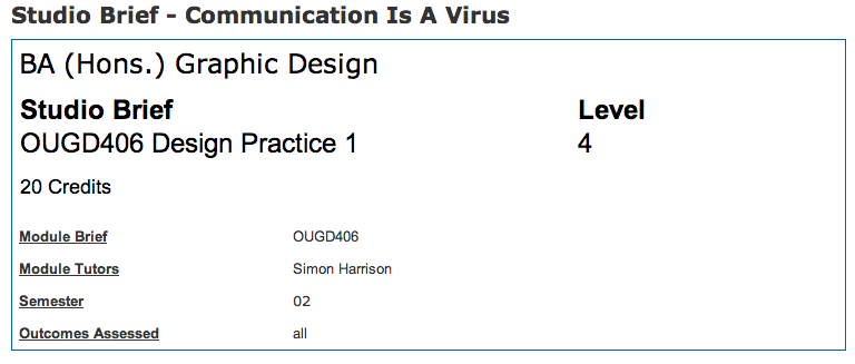
Studio Brief - Communication Is A Virus

Here is the latest brief in the module OUGD406.
This brief is entitled Communication Is A Virus, which relates to how communicating something can make it grow, rapidly. 


Wednesday, 12 February 2014

Attempting to make an obvious concept have deeper connotations (Research):

In an attempt for my design to have connotations that are deeper than the initial aesthics, I am researching such projects to gain help an insight into how it can be done successfully.

K1X DCAC MK4 BY PATRICK MOHR 2013 FALL/WINTER COLLECTION
"After releasing the Mk3 at Pool Munich last year,Designer Patrick Mohr and K1X are with the slick Mk4 collaboration. This latest version is made of high-end suede leather and will be available this December in three new color ways – red, orange and yellow. With improvements compared to older versions such as the workmanship of it’s collar padding, overall embossing and heel-strap magnet.

 The K1X DCAC by Patrick Mohr is a unisex sneaker that can be modified to a variety of different looks via two detachable accessories that can be worn as a wrist band or around the neck.
 This latest collection by Patrick Mohr for K1X is available now at select stockists."
Patrick Mohr's advertising campaign consists of his very expensive new range of footware, being modelled by the homeless. This is a very shocking way of advertising something which will be aimed at the highest end of the fashion market, and items in this price range are familiarly modelled on what society considers: Healthy, beautiful and prosperous people, in adverse to people stricken with poverty.

I see this way of advertising as one that juxtaposes it's self in a way that it grabs the audience's eye and contradicts the principles that companies of this prestige, and with that specific client base would normally aim for.

This of 'misadvertising' is very interesting to me, and finding new, eye-catching, pioneering ways ways to showcase one's work is something that I an fascinated with and would love to consider plenty in my future designs and potentially even career.

Thursday, 6 February 2014

"23 Rock/Metal Album Covers That Will Stun You"

"23 Rock/Metal Album Covers That Will Stun You"

http://www.tooft.com/23-rock-metal-album-covers/

"This article are different than our other articles.This Article don’t have connections with photoshop and computing design.All these album covers are old and they are made by some artist,not by photoshop designers.I hope you will love this article cause this is something new,somthing that you never seen before.Enjoy in this article and share it with your friends!"
AllCDCovers beatles yellow submarine 1969 retail cd front 550x540 23 Rock/Metal Album Covers That Will Stun You

AllCDCovers queen innuendo 1991 retail cd front 550x550 23 Rock/Metal Album Covers That Will Stun You

AllCDCovers aerosmith dream on 1994 retail cd front 550x543 23 Rock/Metal Album Covers That Will Stun You

AllCDCovers van halen 1984 1983 retail cd front 550x543 23 Rock/Metal Album Covers That Will Stun You

Previous Black Sabbath Album covers:

"The album cover features a depiction of Mapledurham Watermill, situated on the River Thames in Oxfordshire, England. Standing in front of the watermill is a figure dressed in black. The name of the woman pictured on the front cover is forgotten, though guitarist Iommi says that she once showed up backstage at a Black Sabbath show and introduced herself. On the original release, the inner gatefold sleeve featured an inverted cross with a poem written inside of it. Allegedly, the band were upset when they discovered this, as it fueled allegations that they were Satanists or Occultists; however, in Osbourne's recent biography, I Am Ozzy, he says that to the best of his knowledge nobody was upset with the inclusion. The album was not packaged with a gate-fold cover in the US."
The above design uses simply typography and the band's logo to indicate that this is their album cover.
It involves the title of the band and the title of the album.
The contrast of red and black is a very strong one, with deep routed connotations attached to it, ones of heavy music, sadism and anarchy in my opinion.

This design to the left is a very shocking and strange one, it depicts some kind of Satanical child, complete with green eyes, yellow teeth and claws and horns. Very disturbing indeed.
The cover uses a blue backdrop, where the baby seems to be made up of gradient layers.
This piece is unlike the band's other designs in the way that it doesn't massively represent their genre of music.
The statues in the image look rather artsy and conceptual, and the typography isn't specifically heavy or rock like, like usually found.

This Black Sabbath album is their most famous cover, it shows a monochromatic photograph of the band members.
This album cover is very rock like, and band photos are commonly executed like this in the modern day.
Again, their famous font and logo is found on this page, in it's thick gothic, uppercase style.
Evaluation

Secret 7 winning entries research:

I have found images of previous Secret 7" winning entries to give me an idea of what types of the work the judges go for, or what seems to be 'trendy' at the secret 7" exhibition.


Previous Lorde Album covers:

With Lorde'e being a relatively new artist, she hasn't released many albums, only one in fact, for this reason I am writing about the other imagery she has related to her including fan made designs and covers for remixes.

Many of these designs are simply based around typography which the designer found appropriate, others make use of her face, being a female artist, many go down that route.
This piece uses feminine neon lights to show the title of her song, in a remix form. This is an unofficial cover which could mean that Lorde didn't have any relation to it being made or how it now looks. I wouldn't have though Lorde would have used the colour pink on her album cover as she seems to have feminist views (almost) and doesn't seem like she wants to go down the girly, dainty route.
Pure Heroine is Lorde's Debut album as an artist, is simply uses a gothic typeface, at the same font size to show her name and the album's name.
The colours are very mundane and the over all look is minimal and subjective. 
Another unofficial design made for a remix of her song, it again uses pink, but shows a heirarchi of font choices, with the artist's name being in a ultra bold, uppercase Gothic type, and the song title being in a light gothic font.
The piece has dark colours involved, but also rich purples and mint greens, these contrast well together which form the outline for a triangle shape with a space image inside.
More remix, unofficial work, this Reefd remix artwork uses Lorde's image and a rainbow gradient to set a tone and a mood. 
I imagine the remix would be related to house music or a genre such as that, as this artwork wouldn't represent Lorde's Royals song well, therefore must be showing the remix of the song.
Another album cover for Lorde's 'Pure Heroine' album, uses her photograph in a suggestive way to show mood and tone, the pose and posture that Lorde is showing is one that leaves the track open to interpretation to the viewer.
The choices of typeface in this show that the name of the artist comes before the name of the album,  with the album being in a daintier typeface to the Uppercase, bold gothic title. 
The piece uses a very suggestive photograph to convey a message about the remix of Lorde's song.
The title font being in a brush stroke style, and central in the design is something which is very trendy at the moment I find.
The piece is well executed, and if it reflected the messages in the remix of the song well enough, is a very good single cover.

Conclusion 
Lorde's official album and single covers can sometimes just consist of typography, and if not images of the artist herself. The typography she chooses to use, bold, uppercase Gothic, reflects her as a person, and in my opinion shows that she isn't particularly drawn to feminine design.

Wednesday, 5 February 2014

Primary research into vinyl covers - Jumbo records:

Knowing that my next brief was going to be for the secret 7" competition entry, I took it upon my self to visit Jumbo records, a record shop in the town center. I felt it would be beneficial to get an insight into vinyl record sleeves as it would be something I would be creating.

The vinyl record to the left is an album which makes use of figurative design, in the form of the artist's face in the foreground and the logo and typography in the central section.This vinyl sets a tone and the connotations attached to the person's Reggae style hat, brandishing the Jamaican flag shows that this is a Reggae album.


The album containing the smoking barrels to the left is representational and inspired by the title of the album, the designer has simply illustrated two barrels which are smoking as a simple way to create concept art for a piece.


The 'Eek a Mouse' album makes use of a great deal of typography as a way to express the tone and genre of the album.
It is a very vibrant piece of design, and I can see why vinyl fans would love a collection of well designed, bright pieces of vinyl.


Adele's album, 19, uses simple but elegant photography to show what the album contains, her genre being popular soul means that her vinyl cover must be accessible art, to appeal to her wide range of fans, and people who would be interested in buying her music for the first time.


The famous Jimi Hendrix album to the right shows use of artist arrangement in the way that the designer chose the 
composition of the figures in the vinyl to set a mood and indicate the genre of this album. Famously, it is very outlandish as Jimi Hendrix was a trend setter. This album uses surreal, stylised work to show something that's non human and interesting.

Monday, 3 February 2014

Single's research: T rex - Get it on

"If ever we need cheering up we reach for this song! Released in 1971 it spent weeks at #1 and went on to sell millions around the world. It’s taken from the album Electric Warrior which has one of our all time favourite artworks done by Hipgnosis, a design group that featured the late great Storm Thorgerson."
"T. Rex were a British rock band, formed in 1967 by singer-songwriter and guitarist Marc Bolan. The band formed as Tyrannosaurus Rex, releasing four underground folk albums under the name."

Lyrics:
"Well you're dirty and sweet Clad in black Don't look back And I love you You're dirty and sweet oh yea 

Well you're slim and you're weak You got the teeth Of the Hydra upon you You're dirty sweet And you're my girl 

Get It On Bang a gong Get It On

 You're built like a car You got a hubcap Diamond star halo You're built like a car Oh yeah 

You're an untamed youth That's the truth With your cloak full of eagles You're dirty sweet And you're my girl 

Well you're windy and wild You got the blues I'm your shoes and your stockings You're windy and wild Oh yeah 

You're built like a car You got a hubcap Diamond star halo You're dirty sweet And you're my girl"

The lyrics part of this song all revolve around T Rex describing a person who is then revealed to be 'his girl', so his partner. He is describing various things about this person's attire, which gives room for lots of design inspiration. The descriptions are relatively the only components of this song.

Tone, instrumental and backing track:
This song is famous for it's tone and mood, and very well know, the backing track which comes across as slightly jazzy with obvious hints of rock, I can see why this song became as popular as it did as it mixes two opposing genres together very well.
Evaluation
This song at first glance doesn't have masses of places to take in depth design inspiration, it is clear cut and as I said in the lyrical analysis part, it revolves just around a person's looks being described. 

Single's research: Roxy music - Virginia Plain

"The first of our two glam rock anthems and an all time favourite of ours! Virginia Plain was the first single the band released back in 1972. Although it didn’t originally feature on their debut album Roxy Music, later pressings did include it. Do have a read of the lyrics, they are brilliantly bonkers."

"Roxy Music are an English art rock band formed in 1971 by Bryan Ferry, who became the group's lead vocalist and chief songwriter, and bassist Graham Simpson. The other members are Phil Manzanera, Andy Mackay and Paul Thompson."


Lyrics:
"Make me a deal and make it straight All signed and sealed, i´ll take it To robert e. lee i´ll show it I hope and pray he don´t blow it ´cause We´ve been around a long time just try try try tryin´ to Make the big time... Take me on a roller coaster Take me for an airplane ride Take me for a six days wonder but don´t you Don´t you throw my pride aside besides What´s real and make believe Baby jane´s in acapulco we are flyin´ down to rio

 Throw me a line i´m sinking fast Clutching at straws can´t make it Havana sound we´re trying hard edge the hipster jiving Last picture shows down the drive-in You´re so sheer you´re so chic Teenage rebel of the week Flavours of the mountain steamline Midnight blue casino floors Dance the cha-cha through till sunrise Open up exclusive doors oh wow! Just like flamingos look the same So me and you, just we two got to search for something new Far beyond the pale horizon Some place near the desert strand Where my studebaker takes me That´s where i´ll make my stand but wait Can´t you see that holzer mane? What´s her name virginia plain"

The lyrics of the song don't really add up to form anything, it seems as if they are just individual sentences which eventually conclude with the answer that apparently has been being searched for.

Tone, instrumental and backing track:
The voices of the vocalists in this track sound silly, and in relation to the lyrics, it sounds as if they are rambling odd sentences to no avail.
The backing track and progression of the music works well with the bizarre words that Roxy Music are saying, and the track feels like it has an element of 'swing' music to it.
Evaluation
I do not like the lyrics of this song or the tone to the music, I feel it is silly and the artists' lyrics don't achieve anything.
The iconography behind the words spoken wouldn't have any context in my opinion, therefore I wouldn't know where to go when designing art work for this track. 
I look forward to seeing the route that my peers go when creating work for this track, but I wouldn't like to.

Single's research: Massive attack - Karmacoma

"It’s a huge honour for us to work with Massive Attack, a band who visual output has been as important to us as their music. Karmacoma was a single from their second album Protection released in 1995."
"Massive Attack is an English musical group from Bristol consisting of Robert "3D" Del Naja and Grant "Daddy G" Marshall, formed in 1988. The duo are considered to be progenitors of the trip hop genre."

Lyrics:
Tricky 

You sure you want to be with me I've nothing to give Won't lie and say this lovin's best Leave us in emotional peace Take a walk, taste the rest No, take a rest 

3D 

I see you digging a hole in your neighborhood You're crazy but you're lazy No need to live in a lean-to Your troubles must be seen to seen to Money like it's paper with faces i remember I drink on a daily basis Though it seldom cools my temper It never cools my temper 

Tricky Walking through the suburbs though not exactly lovers You're a couple, 'specially when your body's doubled Duplicate, then you wait for the next kuwait 

(both)
 Karmacoma, jamaica' aroma (x4)

 3D 

You sure you want to be with me i've nothing to give Take a walk take a rest taste the rest Take a walk take a rest taste the rest Take a walk take a rest a taste of rest 
Tricky 

Don't want to be on top of your list Phenomenally and properly kissed We overcome in sixty seconds With the strength we have to together But for now, emotional ties they stay severed When there's trust there'll be treats And when we funk we'll hear beats 

(both) 

Karmacoma, jamaica' aroma (x4) 3D Deflowering my baby, are you my baby mate I must be crazy, see i'm swazy Digging a hole in your neighborhood You're crazy but you're lazy, must be lazy Tricky Don't wanna on top of your list Monopoly and properly kissed 
3D 

Deflowering my baby, are you my baby mate My baby Deflowering my baby, are you my baby mate I must be crazy, you must be lazy 
(both) Karmacoma, what?, jamaica aroma (x4)"

The tone of the voices in the song make it so that the lyrics merge into one, and it's more of a feeling/backing that, than something in which is vocally strong. 
The song has various levels which it manages to put the listener on, and it appears if there is a story to be told, when listening. 

In the lyrics there are lots of different mental imagery which come to mind, which aren't deciphered when listening to the song alone.

This is the first Time I have heard Massive Attack's music, and in the sense of this song, I'm not particularly impressed. 

Tone, instrumental and backing track:
The tone of the track leaves an open feeling the listener which is intriguing, but I don't feel the lyrics come across by the vocalists, so there is something left to be desired.

It seems as if when the vocalists reach the title/chorus of the track " Karmacoma, jamaica' aroma", the backing track changes and amplifies into something more, as what the lyrics are describing is a feeling of ' Karmacoma'.

Evaluation
I do not like this song, the backing track or the lyrics involved, for this reason It is far from my first choice as the track which I would like to create a vinyl 7" record sleeve for.