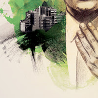
I love how Chris Valentine has used multiple mediums in his illustrations, one being the graphite/smudge stick, and the other being water colour paints. The illustration he has created puts massive amounts of emphasis and attention on the male figure, showing the city scape around his shoulders, displaying that he. in a sense, is bigger/greater than the city.
The colours used by the water colour paints set a certain mood around the design, such as the green tones to the left of the character portray nature to me and organic substances, where as the shades of red, blended with dark greys over the right shoulder appear as an explosion.
I love how the texture of the paper comes out due to the viscosity of the water colours, and how the flesh tones created by the graphite are powerful and emotive.

