Friday, 13 December 2013

Initial thoughts after receiving my word Nature


 I created a small spider diagram with Nature being the central word. And located a description of the word nature on the internet:
"Nature, in the broadest sense, is equivalent to the natural, physical, or material world or universe. "Nature" refers to the phenomena of the physical world, and also to life in general. "

RESEARCH PROPOSAL

RESEARCH PROPOSAL:

MY SUBJECT MATTER IS:

  • Nature

POSSIBLE CATEGORIES WILL INCLUDE:

  • Organic food
  • Free range animals
  • Landscapes rural
  • Weather
  • Natural
  • Artists - John Constable, Chris Ofili
  • Opposite - Industry, urban
  • Self sufficient.
  • Films about nature: Into the wild, 127 hours, Finding Nemo etc
RESEARCH PROCESSES WILL INCLUDE:
  • Photographs
  • Printing
  • Primary & Secondary
  • Questionnaires
  • Documentaries
  • Television
HOW YOU WILL RESEARCH:
Primary Methods:
  • Photographs 
  • interviews
  • Questionnaires 
Secondary Methods:
  • Internet
  • Books
  • Television
WHO/WHERE/WILL YOU RESEARCH?
  • Natural surroundings
  • Photographs
  • Explorers - Ranulph Fiennes, Bear Grylls
  • Film makers - David Attenborough, Walt Disney

NATURE

Using http://www.visualthesaurus.com/ I have created a spider diagram thesaurus which shows the words related to my word of nature.


OUGD405 Design Process


Having been given the brief for OUGD405 Design Process, and the word NATURE to use in conjunction with this, I began brainstorming ideas which I could relate to nature, and not necessarily directly. 

Edible type Fruit and vegetable letter

http://www.behance.net/gallery/Good-Food/688244
Knowing that we eventually had to create a type related food substance, I began to research other artists' type food creations.


It is evident to see here that the designer has cut out each glyph of the alphabet from fruit and other natural foods.The result is one that looks very childlike and playful which could be a good idea to encourage children to eat their vegetables.

http://www.behance.net/gallery/Breakfast-Typeface/11686585


This designer has created various sentences out of breakfast foods such as cereal, toast, butter, jam and. honey. Again, the food looks very inviting and friendly, very playful food source.

http://www.behance.net/gallery/More-Dessert/11234491


This piece uses 4 different fonts to various effect which it then goes on to spelling out a sentence. It is very vibrant and feminine due to the tone of colour involved.
http://www.behance.net/gallery/Hand-made-type-face-from-kiwi-seeds/1111567


This piece has been made from fruit seeds. I feel the full alphabet has a big impact due to the amount of small items that it has been comprised of. 

http://www.behance.net/gallery/Doritos-Typeface/3939671

The full Uppercase alphabet has been spelt out using triangular shaped doritos.
It is clear to see the gothic style font that the designer has based it on.

Thursday, 12 December 2013

Font research-Goudy Old Style:

After researching fonts and how they can be used to reflect high end brands/elegance in a product, I now should find a font which works for my product/design.
Goudy Old Style:
Having found a font I feel is fitting for my photo backing paper design I now need to decide how I would like to order the fonts on the frame and also what I would like for the backing paper to say about the frame in general, for the customer to see. 
Using Photoshop I have made the font ultra bold and varied the typefaces so I have Sentence case bold, Italic bold and Uppercase bold. 
I feel the Uppercase ultra bold font works very well and should look very good on my frame's backing paper. 

Primary research into foil blocking:

From looking at foil blocking and gold on black I have developed an interest into finding actual examples of black on gold in fashion and other higher end sources.
 Puma trainer:
The use of black and gold found on my Puma trainers is different to the other examples such as The Heist and Great Gatsby due to the font being an uppercase block font. See as Puma is a sports brand, it is clear to see why the would use such a type face, and it is in fact unusual to see such a typeface presented in this decorous style as a sports brand doesn't conform to the higher end of fashion such as Versace makes use of black and gold.
Trainer Spotter:
This tag for the brand 'Trainer Spotter' uses foil blocking technique to print their name and logo onto a piece of high GSM black card.
The tag uses a logo which, in scale, is larger than the font, and the font which is a clean cut, sharp gothic utilises uppercase to increase legibility. 

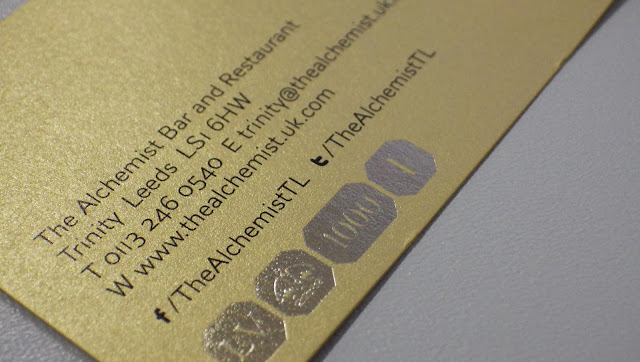
The Alchemist:
This business for the Alchemist Bar and Restaurant uses foil blocking on the logo of their business card to express a tasteful and sophisticated place to dine in.
Like the other examples I have shown, the Alchemist makes use of an uppercase font aside a larger foiled logo.
The reverse of the business card uses blocking to show the company's accolades and awards, in an attempt to grab the audience's attention with the prestige of the restaurant.
Evaluation:
From my primary and secondary research into foil blocking, high end typefaces and the use of gold on black, I have learnt that:
  1. Foil blocking can achieve a level of sophistication if it is not overdone of executed in a tacky way.
  2. Uppercase fonts work very well to express wealth, prosperity and a business to be proud of. 
  3. Gold on black can be minimal and discrete, yet classy and effective.
  4. The hierarchy of type can be applied to show varying levels of importance on a business card/poster. 

Secondary research into foil blocking:

From the feedback received in the interim crit surrounding the influence I took from Macklemore's The Heist album, I was informed that I should research Foil blocking techniques as they can look rather elegant and high end. 
The Heist:
I love the use of the gold typeface against the solid, black leather found on The Heist's album cover. I feel the dark, black leather texture sets a really strong tone, and the gold on this brings out a sense of classiness and wealth.
Macklemore's The Heist uses a Serif font in upper case to show dominance and power, It has been suggested by my crit group that I make use of Uppercase in my foil blocking experiments also. 
Watch the throne:
The Heist album makes me think of Jay Z's watch the Throne album cover which also makes use of black and gold, and a very stylish and elegant looking album cover.
Jay Z's album cover uses a Gothic font in uppercase to stand out and show give an authoritarian feel to the case. The Great Gatsby:
The two album covers I have shown also lead me down the route of the modern day Great Gatsby film posters, which creates a very refined and sophisticated mood, which reflects the film accurately, as it is based around the socialites based in early 20th America.
The poster makes use of a distinguished gold finish, and a silver foiled art deco style font in uppercase, where just the character's Surname is in the deco style font, and 'The Great' is in a gothic font, of a lower point size, to show hierarchy of type. 

Although I love this film poster series and it appeals to me very much, I do see it a rather 'over kill' and over the top when it comes down to elegance, and feel some may see this as tacky. 
The typeface really jumps out to me, but I feel on my picture frame, using an Art Deco font could set the wrong tone and feel. 

Wednesday, 4 December 2013

Initial look at 'high end' fashion and their corporate identity:

Following on form the crit, I have decided to look into high end fashion brands to gain knowledge of what a more classy font looks like, and eventually take inspiration from these companies which I can take into my designs.

Here I have managed to find a very wide range of high end fashion companies and their logos in vector form, which makes it very easy to critique the fonts and logos.
 Surprisingly, many of these fonts aren't of the serif variety, which shocks me as previously I suspected they were, or that they'd be script/calligraphy style, as I find that high end and elegant.

Certain fonts such as the 'Oscar de la renta', 'Paul Smith' 'Pepe Jeans', and also the Cartier below are all script/calligraphy, which isn't actually that many in the grand scheme of logos found here, but they are very elegant, but also very simple. I can see why these companies have chosen to use this script style font as in most cases due to the fashion designers owning the company, they have used their signature to reflect elegance, honesty and trustworthiness. The script fonts make use of wide bowls and large curves to show flamboyance and femininity.

Certain fonts which are sans serif jump out to me such as the 'Marc Jacobs', 'Versace', 'Escada' and also 'Gucci' due to how simple they come across and legible also. Legibility/readability comes across as honest and trusting in a company as you can read it simply and doesn't look like they're trying to deceive.

Many of these fonts use block capitals to stand out and also look bold and prominent (again hierarchy of type). The fonts which do use serifs are very spaced apart to show legibility and simplicity as well as retaining elegance and flow. 
Evaluation:
From this short piece of research I have realised how the most famous brands make use of simplicity, and elegance is not a place for fonts which are hard to read or illegible as it comes across as they have something to hide or are being deceitful. 

Research into high end clothing brands and their typography-Versace:

My knowledge of Versace goes as far as knowing they're a brand for the rich and famous, and their attire is very expensive. 
Secondary Research:
I have selected some of Versace's goods found on google to show how the brand uses Black and Gold to a power, tasteful/flashy extent. 
I do like this use of colour and feel it can reflect prosperity, taste and wealth if done in the right ways, if not, I do understand that it can look cheap and excessive. 

Research into high end clothing brands and their typography-Dolce & Gabbana:

http://listdose.com/top-10-best-luxury-clothing-brands-world/
Using google I managed to find a site which lists the top 10 best luxury clothing brands, here is the information I found out about the companies and their tone of voice.

Dolce & Gabbana:
"Dolce & Gabbana is an Italian luxury fashion house established in the year 1982 by Domencio Dolce and Stefano Gabbana. In today’s luxury fashion industry, Dolce & Gabbana are unarguably the most influential and leading designers who have made the modern woman look fantastically sexy. Their sweet and sharp style is very popular among the best dressed celebrities around the world."


Dolce & Gabbana make use of a very clean cut, style using a sans serif font. they also use upper case when it comes down to showing their name which reflects dominance in the brand and is a use of hierarchy.


Thursday, 28 November 2013

Photoframe research - Argos online

http://www.argos.co.uk/static/Search/searchTerms/PHOTO+FRAMES.htm


Photoframe research - Wilkinsons online.

Using Wilko's wesbite, I have found various frames as an example of how frames are displayed online. 
The brief description that Wilko gives about their products includes the name of the frame, the type of material that it has been created from or to mimic, and also the size of the frame.  

Certain frames display a background that is are very unattractive, but can be quite eye catching, but not in a elegant sense, as if they'd appeal more to children, or a more juvenile market. 

These two frames which I have selected appear more up market and high end in Wilko's range, it appears as if the tarket market for this frame would be of an older generation, due to the person found in the background image. This can be very bias and subjective, as in theory, this style of frame could work in a general house with typical decor, but the background of this has set a completely different tone of voice to the frame itself.  
This silver effect frame has again set a specific tone of voice to the frame due to the fact it has included a very feminine, pink flower as the background image. Due to the background image, you'd imagine this frame to be found in an older woman's bedroom, or living room.

This has given me a big insight into how the background image found in a frame can instantly subject the target market of the pieces, when in reality, any person could buy the photo frame.

Monday, 11 November 2013

Shepard Fairey Hope poster Illustrator research:


Shepard Fairey, the California based graphic designer and skater, shot to instant fame upon his creation for Barack Obama's election campaign when the designer created the famous 'Hope' posters for the President's election.

His designs are known all around the world as the helped massively in Obama's election.

The New Yorker art critic Peter Schjeldahl called the poster "the most efficacious American political illustration since 'Uncle Sam Wants You'".

Obama directly contacted Fairey in an attempt to prise his for his work:    "I would like to thank you for using your talent in support of my campaign. The political messages involved in your work have encouraged Americans to believe they can change the status-quo. Your images have a profound effect on people, whether seen in a gallery or on a stop sign. I am privileged to be a part of your artwork and proud to have your support. I wish you continued success and creativity.– Barack Obama, February 22, 2008"

I feel Shepard Fairey's work is so effective due to the minimalism of his design and the use of few colours, which gives an emotive impact on the viewer. The colours were chosen to relate to America's patriotism, in the red white and blue style, and the font, Gotham, instantly blew up as everyone recognised it for this piece of work.
This style of illustration is what Fairey is renowned for, and the simplicity in his portraiture design, which signifies Barack Obama, as a powerful, trustworthy and wise man, is one of the factors which lead him to being America's modern day president.
Fairey's design has been replicated in many instances due to it's simplicity, but the true image will always be remembered due to it's impact on the American audience, and the emotive response this simple piece of minimal design design achieved.
Fairey's original illustration poster makes use of many effects which benefit illustrations, it has clearly been created digitally, using few lines and solid block shapes, I could carry this method forward when creating my poster, in an attempt to create a minimal and effective series of posters. 

Steve Powers Illustrator research:


Steve Powers is a famous sign writer in Brooklyn NewYork.
"Stephen J. Powers (born May 25, 1968) is a New York City artist who at one time wrote graffiti in Philadelphia and New York under the name ESPO ("Exterior Surface Painting Outreach")."

He has a notorious history in street graffiti art, but in modern times, he more commercially creates signs.

Powers can sometimes use minimal colours in his creations but still get a message across very effectively, it is useful to me to see his designs as I must create an effective two colour piece of design, and also typography for my OUGD403 project. 


As you can see, Powers' signs are beautiful, eye catching and emotive, he does an amazing job at conveying his messages using typography. 
I suppose in a way, Powers is the American Banksy of type. 

Fabio Fragiocomo - Creative advertising lecture

After attending a lecture presented Fabio Fragiocomo, I feel I have learnt about forms of advertising and specific renown adverts in the world that could have influenced my ides in previous projects.

Specifically, this poster based around animal cruelty and the use of fur would have benefitted me in my previous newspaper project as the style of it is already strikingly similar to the format of design that I went for.
I feel the two tone format of red and black colours in this design is very similar to the pieces which I created surrounding the newspaper project, and in retrospect, it would have been very useful for me to know about this design in that project as I could have used it as inspiration to show how it directly influenced my designs.


Thursday, 7 November 2013

Edward Ardizzone Illustrator research:

Edward Ardizzone is an artist who's name I picked up in Matt Hodgson's lecture on Wednesday. This illustrator particularly stood out to me due to the juxtapose found in his work, I found it very shocking.

"Edward Jeffrey Irving Ardizzone,  was an English artist and creator of children's books. For Tim All Alone (Oxford, 1956), which he wrote and illustrated, Ardizzone won the inaugural Kate Greenaway Medal from the Library Association, recognising the year's best children's book illustration by a British subject."

Ardizzone was massively famous for his endearing, juvenile illustrations, sketched in such a way that they denote playfulness, innocence and childlike emotions. He was celebrated as a master of children's illustrations.

The next part shocked me massively, as the artist was known widely for creating this beautiful, humble pieces designed for children's eyes, he then, during the second World War's period, turned his hand to being a war time illustrator.


"In World War II Ardizzone worked as an full-time, official war artist assigned to the War Office by the War Artists' Advisory Committee. He first served with the British Expeditionary Force in France and Belgium before being evacuated back to Britain. In January 1942 he recorded the arrival of American troops in Northern Ireland.An extensive collection of his war pictures, as well as his wartime diaries, can be seen at The Imperial War Museum." 

As you can see, his war time work has such a different tone to his previous children's illustrations, which is an incredible feat of skill in my eyes. Ardizzone's war time pieces make use of very mundane and unilluminated colours, to set the sinister tone of war time conditions. His illustrations aren't even in the same child like style as previously, and now hold a very emotive stance which grips the viewer.