From looking at foil blocking and gold on black I have developed an interest into finding actual examples of black on gold in fashion and other higher end sources.
Puma trainer:The use of black and gold found on my Puma trainers is different to the other examples such as The Heist and Great Gatsby due to the font being an uppercase block font. See as Puma is a sports brand, it is clear to see why the would use such a type face, and it is in fact unusual to see such a typeface presented in this decorous style as a sports brand doesn't conform to the higher end of fashion such as Versace makes use of black and gold.
Trainer Spotter:
This tag for the brand 'Trainer Spotter' uses foil blocking technique to print their name and logo onto a piece of high GSM black card.
The tag uses a logo which, in scale, is larger than the font, and the font which is a clean cut, sharp gothic utilises uppercase to increase legibility.
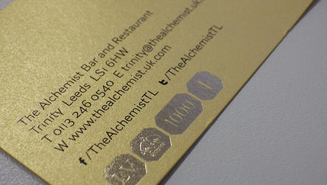
The Alchemist:
This business for the Alchemist Bar and Restaurant uses foil blocking on the logo of their business card to express a tasteful and sophisticated place to dine in.
Like the other examples I have shown, the Alchemist makes use of an uppercase font aside a larger foiled logo.
The reverse of the business card uses blocking to show the company's accolades and awards, in an attempt to grab the audience's attention with the prestige of the restaurant.
Evaluation:
From my primary and secondary research into foil blocking, high end typefaces and the use of gold on black, I have learnt that:
- Foil blocking can achieve a level of sophistication if it is not overdone of executed in a tacky way.
- Uppercase fonts work very well to express wealth, prosperity and a business to be proud of.
- Gold on black can be minimal and discrete, yet classy and effective.
- The hierarchy of type can be applied to show varying levels of importance on a business card/poster.


