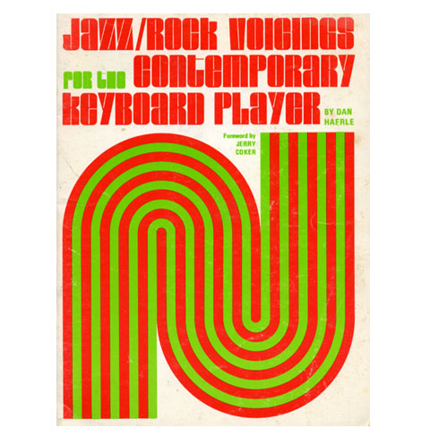
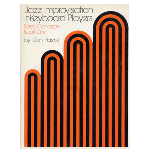
I have discovered these two pieces of design which makes use of only two colours which don't include the paper stock. These two designs have been made for music sheets, to aid people learn how to play music. The covers of these issues are clearly very effective, punchy and bright.
I am amazed how vibrant these two pieces stand out and are that effective when they're only two colours.


These dual colour posters work very effectively and appear a lot more detailed than the previous two. The design for the Source Code movie poster is very creative, it is clear that this poster has been screen printed, with the cyan underneath and the black tone on top, which then works in conjunction with the newsprint type paper.
The Citroen poster which relates to 1975, and in this instance the designer has used numbers as image. It has been digital printed onto an off white paper. It has more than two colours which have been used, so obviously isn't a dual colour poster.